Your website is your virtual storefront, people may become familiar with your brand through other platforms such as social media or trade shows, but your website is the place they visit when they want more information about your business and your products.
However, although websites are gaining prominence in the built environment, there are still manufacturers falling short of their competitors with underperforming sites.
But where should construction product businesses start if they want to improve their website?
With this in mind here are 5 easy fixes for your construction products website to give an excellent first impression, communicate the essentials and educate your prospects.
1. Have an offer above the fold
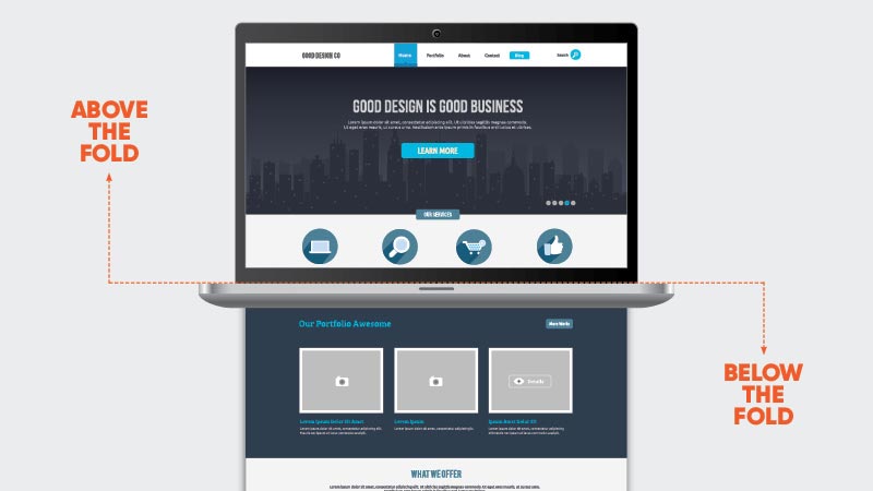
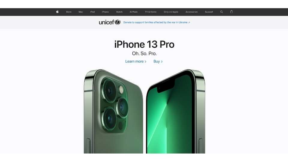
Above the fold refers to the images, text, and links on a website before you scroll down. (It comes from the newspaper industry). It's the first thing anyone sees when they load up your website, so this must make a good impression. It must also direct specifiers immediately to where they want to go next, with minimum thought or effort.

The 'offer' doesn't refer to a discount code or coupon but a message. This message should use 'short, choppy copy', be enticing to potential customers, and be customer-centric. It needs to succinctly explain how your business can help your target customer overcome their challenges by providing them with a solution.
Avoid things like "We have 50 years of experience", etc. These inwards statements speak about yourself, but specifiers want to know about how you can help them.
Use one short sentence that's relevant from the customer's perspective. Consider what your customer will achieve/overcome by becoming your customer, and then tell them exactly this.
Here are some further things to consider with any features that are positioned above the fold of your construction products website's homepage.
- Make your assurances aspirational, how are you going to make the customer's job/life easier.
- Tell them the problem you're going to solve for them, be direct and spell it out in a clear and obvious way.
2. Include clear calls to action On Your Building Product Website
A call to action (CTA) is typically a button, image or line of text that encourages the reader to do something. A common example would be a ‘Buy Now’ button placed in the top right corner of your website. This is an example of a direct CTA. CTA’s are also used to get newsletter sign-ups, eBook downloads, or fill out contact forms. These are known as transactional CTA’s.

They need to be eye-catching, actionable, clear and specific. They also need to be placed in the most effective areas possible. Research shows when we come on to a webpage, our eyes scan the page in a Z pattern from top left, to top right, then bottom right to bottom left. So place your CTA’s accordingly. Be consistent with their design and make sure the landing page that the CTA links to is compatible with the offer in the CTA.
Consider what architects and specifiers are looking for when they land on your website, not what you want to show. We have found that at the top of this are usually the same for most specifiers :
- Technical information
- Case studies
- Cost (even a brief idea)
- High quality imagery and video
- Easily accessible regional experts
- Reviews
- Locations where they can see, touch, and assess your product in action
Repeat your CTA’s throughout your website and have a mix of both direct and transactional to ensure you’re providing a relevant offer to customers at different stages of the buyer’s journey.
3. Use High-images On Your Building Product Website
A website is a visual medium, so don't just stick to words. Use images, photos, videos and icons to bring your page to life and to show your product in the incredible detail that specifiers are looking for.
Rather than using stock images, create a familiarity between your website visitors, your staff, and your products. Invest in professional photography and video to communicate this. Stock footage is easy, and it looks excellent. However, it doesn't instil trust in specifiers; we've found it can even make them feel 'dupped', and you don't want this for your brand.
Don't forget to show your completed projects on your case study pages and images of your products, both as singular item items and how they play a part in making a project a success.
4. Breakdown your Building Products
If you sell lots of products, provide various services, or do both, it can be challenging to explain this to a new customer in simple terms, but that's precisely what you need to do. Specifiers do not understand what your product 'BS14901' is, nor do they know each regulation that applies to it. There are over 5000 individual components in any given construction project. You cannot expect the specifier to be an expert in your field. After all, that's why they've come to you.
Package the key messages you want to convey in an easily accessible way. Name your products simply, and ensure your regulatory certifications are easily attainable. Allow the specifier to find the information they need without getting snagged.
First, you need to find an umbrella term that encompasses what you do and then turn this into your key message. You can then diversify further down your homepage or on separate pages. Your messaging needs to be specific for each of your offerings but have a consistent desire to help the customer overcome their challenge.
You might think your business model is too complex to be simplified in such a way, but in the words of Albert Einstien, "If you can't explain it simply, you don't understand it well enough."
Finding that umbrella message that unites everything you do will help break it down for you and your customers.
5. Use as few words as possible
Websites, social media and blogs all get scanned more than they get read. A study showed that ‘79% of test users always scanned any new page they came across; only 16% read word-by-word.’ So adapt your website to reflect this, if you’ve got a large paragraph at the top of your page it’s going to get ignored.
Remember to keep all your copy brief, punchy and relevant to the customer. As you move further down your construction products website you can include longer bits of copy but still clear of extended paragraphs. Imagine you’ve got 10 tweets to write all the copy for your website and stick to that. This way you’ll break everything down to the essentials without the added fluff or start to talk about your own business too much. Remember the focus is on the customer and how you can help them, so help them by keeping it concise and digestible.
If under certain circumstances you do need to write a paragraph or two, maybe under a product description, then use a read more link that expands the text if the website visitor wants to read it. Give them the choice to take in the information that is relevant to them and their problem. Images, bullet points, and video can all replace text and make your website user friendly.
Conclusion
By using these 5 easy fixes for your construction products website, you can make a productive effort to improve the experience that potential customers have when they visit your website. Summarise what you can do for people above the fold of your website, signpost your content offers using CTA’s, use plenty of images to prove your successes, break down your offerings to keep your messaging targeted and keep your copy clear and concise. Make these straightforward changes and you’ll be providing value to your construction products website visitors every step of the way.
About Insynth
At Insynth we deliver a predictable flow of leads, customers, and specifications for building product brands through our inbound marketing approach, proven to reach a technically demanding audience.
We use the latest marketing techniques such as construction inbound marketing, to equip building product companies to grow sustainability in this era of digital transformation.
As the only HubSpot certified agency to major in construction marketing. We have a proven formula of bringing a variety of functionalities together including CRM Implementation, Web Design, Sales Automation, SEO, and Email Marketing to achieve your ultimate aim: Growing your business and gaining new specifiers and customers.

