2 min read
Insynth @INBOUND19 - What's In a CTA? Tips, Tricks, & Statistics
![]() Rich Newsome
:
04-Sep-2019 20:12:16
Rich Newsome
:
04-Sep-2019 20:12:16


Travis’s Twitter: https://twitter.com/stompwampa
Technical marketing manager, Travis McGinnis carried out an in-depth research study about call-to-action buttons. He wanted to know what the average CTR was but couldn't find anything.
So he did his own study, which was shared by Neil Patel & Crazy Egg!
‘What’s In a CTA’ shares the results of that research along with some tips for messaging and placement for creating killer CTAs that outperform the best of the best, all based on research and data.
Travis aims to deliver insights on:
- The correct placement of CTAs
- Actionable tips and tricks for CTA messaging
- The average CTA click-through rate, broken down by CTA type
Calls To Action
How many of you have CTAs on your website? A CTA element should guide the user to take the most logical next step.
E.G: Subscribe to a newsletter, download an eBook, schedule a meeting
In order to do this successfully, every company should have at least one buyer persona. This is fundamental in understanding your customers; who they are and what their challenges are.
Research On CTAs
Travis carried out research on click-through-rates from CTAs to discover which were the most successful. Before we explore Travis’ findings, we’ll look at the different types of CTA that you can use.
Button CTAs
A simple background colour with a short line of text, such as ‘read more’ or ‘add to cart’
Text CTAs
A simple text link of any length.
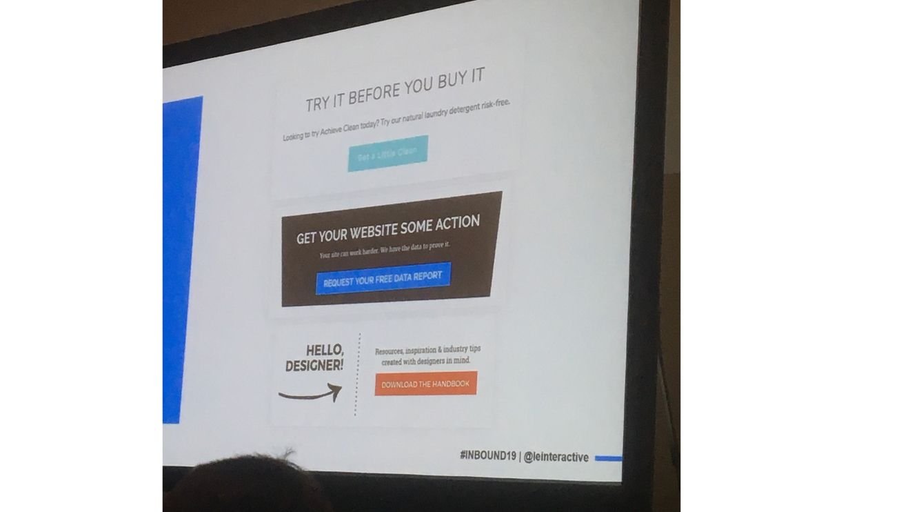
Designed CTAS
A more complex design that may include an image
Travis found that button CTAs are known to perform better than all other CTAs. This suggests that customers are more attracted to CTAs that are simple and clear.
Tips to improve Your CTAs
Travis provided a series of simple tips you can use to enhance your CTAs.
1. Placement
Add CTAs to more relevant pages. What webpage are your customers on? Maybe they’re reading about SBEM calculations. Include a CTA that allows them to receive a free quote on a SBEM calculation.
3. Choose words wisely
Include words that are relevant to the customer’s needs.
4. Be clear and provide value
Referring back to Travis’ findings, the clearer and more simple the CTA, the more successful it’ll be.
5. Don’t be afraid to get creative
This depends on the service you provide. If you can afford to be a bit more risqué with your word and image choices based on your buyer personas, head down the creative route.
Conclusion
CTAs are what turns a visitor into a lead, and eventually a customer. If you’d like to learn more about how to create tailored, relevant CTAs based on every stage of the buyers journey, get in touch today.


